Visual Design Principles
The core principles that make any diagram, chart, or visual clearer. No design degree required.
From Diagrams That Speak — Drew Bruce | The Practical Thinker
1
Contrast

What It Is
Make important things visually different from less important things. Size, colour, weight, or position.
Try This
Ask yourself — if someone glances at this for three seconds, what do they see first? If the answer isn't the most important thing, adjust the contrast.
2
Alignment
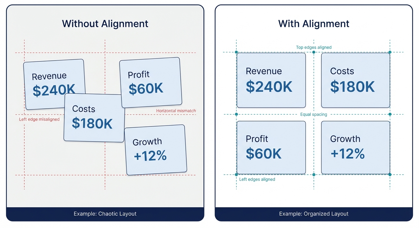
What It Is
Elements that are related should be visually aligned. Invisible grid lines create order from chaos.
Try This
Pick one alignment edge (left, centre, or top) and make everything snap to it. Misalignment creates visual noise even when people can't articulate why.
3
Proximity
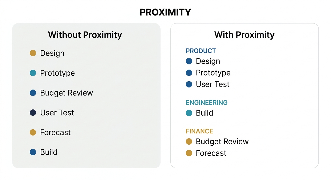
What It Is
Things that belong together should be close together. Things that don't should be further apart. Space creates meaning.
Try This
Group related labels, icons, or data points. The white space between groups tells the reader "these are different categories" without needing a single word.
4
Hierarchy

What It Is
Not everything is equally important. Use size, position, and emphasis to show the reader where to look first, second, and third.
Try This
Squint at your diagram. Can you still tell what the headline is? If everything looks the same when blurred, you have a hierarchy problem.
5
Simplicity
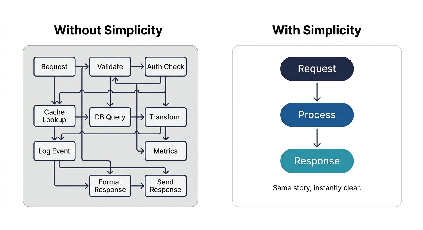
What It Is
What you leave out matters as much as what you put in. Every element should earn its place.
Try This
Remove one element. If the meaning survives, it didn't need to be there. Keep removing until something breaks. That's your minimum viable diagram.
6
Consistency
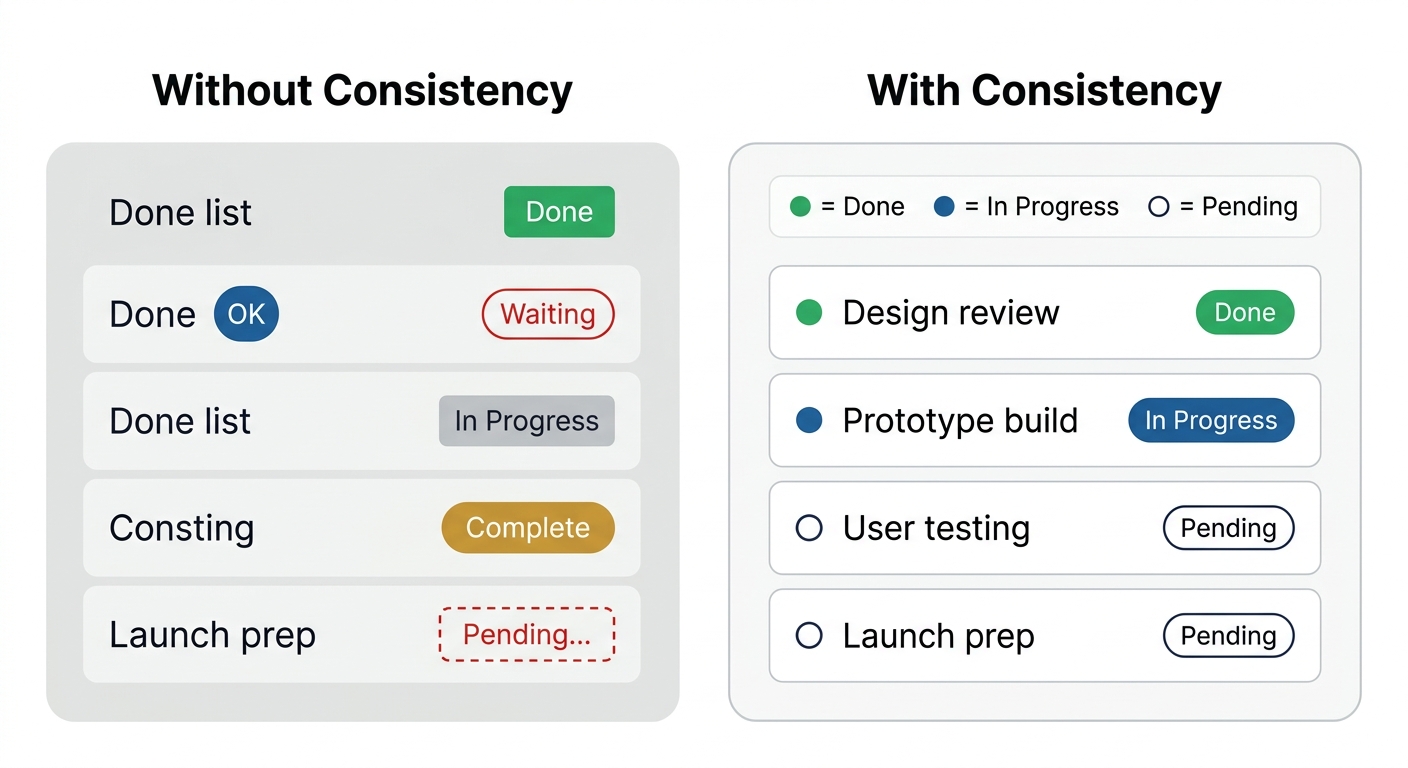
What It Is
Use the same visual language throughout. Same colours mean the same things. Same shapes mean the same types.
Try This
Create a simple legend — even if it's just in your head. Blue means X, circles mean Y, dashed lines mean Z. Then enforce it ruthlessly.